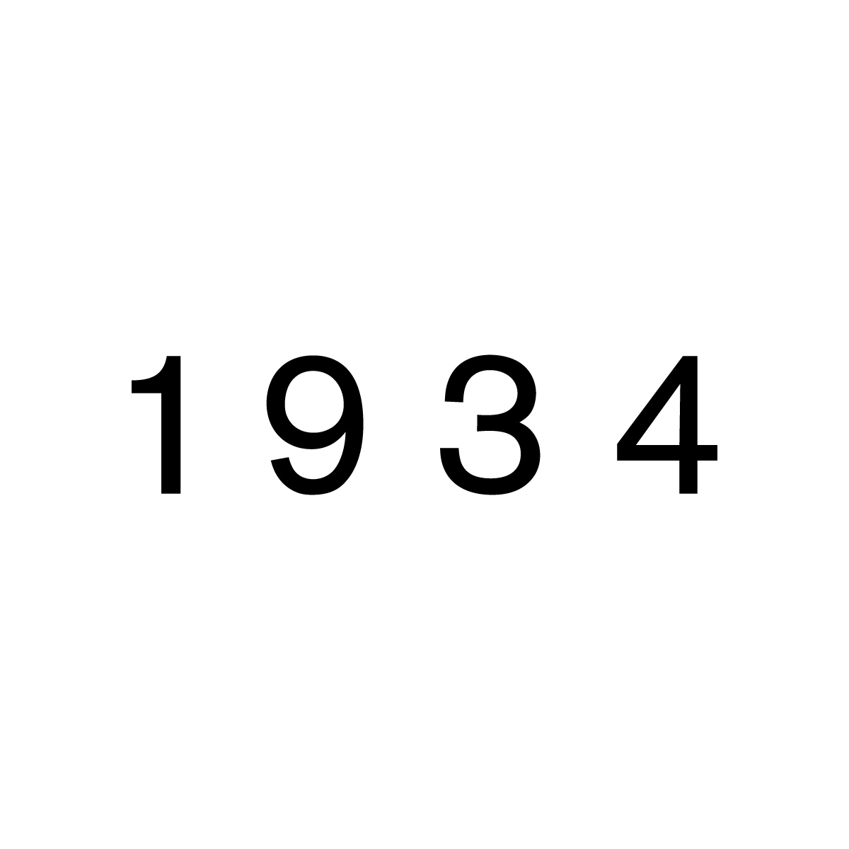
In 2018, I worked with London-based dealers in twentieth century furniture, Abel and Sloane on their book The Simple Heart of Plywood. Subsequently, I carried out some consultancy work in relation to the branding of their company 1 9 3 4, researching early grotesk typefaces. After considering various fonts, it was decided by all three of us that although Akzidenz Grotesk was designed prior to 1934 (it was released by the Berthold Type Foundry in 1898), it was the most visually appropriate solution for this set of numerals, and perhaps more importantly, the space between them.